Visualizations in R
Alex Slavenko and Maria Novosolov
Introduction
In this workshop we will focus three topics:
How to prepare our plots for publication
How to create interactive visualizations
How to create geographic visualizations
We will use data on per capita alcohol consumption in the countries of the world in 2010. At first, we will explore the data by generating typical plots. We will learn how to manipulate and design these plots to make them publication worthy, and how to turn them into interactive plots. We will then use the same data in shapefile format to learn how to plot the data on a global map.
First thing is to make sure you have all the libraries uploaded for this session.
A bit more preperation before we start: add all the fonts in your computer to R
font_import(prompt = F) #this imports fonts from your computer into R, and may take a lot of time
#load the fonts
loadfonts(quiet = T) #you may need to change the device, depending on whether you want to print the plot in R or export it
Next, upload the data into your work environment. Make sure to change the path that you are using in the following code to fit the path for the file in your computer. We will upload the spatial data (the map) that we will use later, and save the metadata as a tibble to use it in the first part of the session. For your work, make sure to set the working directory with:
setwd(“your/path/to/data/file”)
or always add it when you read the file in.
#upload the spatial file using geojson and specifying to R that it's a shapefile
data_vis.sp <- geojsonio::geojson_read("country_alcohol.geojson",
  what = "sp")
#save the data from the shapefile into a tibble
data_vis <- as_tibble(data_vis.sp@data)
#manipulate the data a bit to make population numeric
data_vis <- data_vis %>%
  mutate(POP_CNTRY = as.character(POP_CNTRY)) %>%
  filter(POP_CNTRY != "-99999") %>%
  mutate(POP_CNTRY = as.numeric(POP_CNTRY))
#remove all the lines with NA's. The function complete.cases removes all the lines that have NA's in them somewhere
data_vis <- data_vis[complete.cases(data_vis), ]
Let’s view our data:
data_vis## # A tibble: 168 x 15
## ID FIPS_CNTRY CNTRY_NAME POP_CNTRY SQKM_CNTRY LANDLOCKED ISLAND
## <int> <fct> <fct> <dbl> <dbl> <fct> <fct>
## 1 2 AF Afghanist… 17250390 641869. Y N
## 2 3 AG Algeria 27459230 2320972 N N
## 3 4 AJ Azerbaijan 5487866 85808. Y N
## 4 5 AL Albania 3416945 28754. N N
## 5 6 AM Armenia 3377228 29872. Y N
## 6 8 AO Angola 11527260 1252421 N N
## 7 9 AR Argentina 33796870 2781013 N N
## 8 10 AS Australia 17827520 7706142 N N
## 9 11 AU Austria 7755406 83739. Y N
## 10 14 BC Botswana 1446623 580011. Y N
## # ... with 158 more rows, and 8 more variables: Continent <fct>,
## # spirits <dbl>, beer <dbl>, wine <dbl>, total <dbl>, x <dbl>, y <dbl>,
## # rmapshaperid <int>#look at the data. tibble equivalent to str
glimpse(data_vis)## Observations: 168
## Variables: 15
## $ ID <int> 2, 3, 4, 5, 6, 8, 9, 10, 11, 14, 15, 16, 17, 18, ...
## $ FIPS_CNTRY <fct> AF, AG, AJ, AL, AM, AO, AR, AS, AU, BC, BE, BF, B...
## $ CNTRY_NAME <fct> Afghanistan, Algeria, Azerbaijan, Albania, Armeni...
## $ POP_CNTRY <dbl> 17250390, 27459230, 5487866, 3416945, 3377228, 11...
## $ SQKM_CNTRY <dbl> 641869.188, 2320972.000, 85808.203, 28754.500, 29...
## $ LANDLOCKED <fct> Y, N, Y, N, Y, N, N, N, Y, Y, N, N, N, N, N, Y, N...
## $ ISLAND <fct> N, N, N, N, N, N, N, N, N, N, N, Y, N, N, N, N, N...
## $ Continent <fct> Asia, Africa, Asia, Europe, Europe, Africa, South...
## $ spirits <dbl> 0.00, 0.04, 1.46, 2.23, 3.52, 0.64, 0.45, 1.30, 1...
## $ beer <dbl> 0.01, 0.17, 0.16, 1.61, 0.39, 5.12, 3.32, 4.51, 6...
## $ wine <dbl> 0.00, 0.23, 0.22, 1.32, 0.30, 1.95, 3.91, 3.87, 4...
## $ total <dbl> 0.01, 0.44, 1.84, 5.16, 4.21, 7.71, 7.68, 9.68, 1...
## $ x <dbl> 66.0265, 2.6324, 47.5323, 20.0684, 44.9479, 17.54...
## $ y <dbl> 33.8389, 28.1634, 40.2922, 41.1426, 40.2864, -12....
## $ rmapshaperid <int> 0, 1, 2, 3, 4, 5, 6, 7, 8, 9, 10, 11, 12, 13, 14,...Each row in our data is a country. Our columns give data for each country on its population, area (in square km), if it’s landlocked or not, if it’s an island nation or not, which continent it is on, and the per capita alcohol consumption for 2010: in spirits, beer, wine, and the total consumption.
Now, let’s start plotting!
Publication quality plots
First, we’ll plot some data. We’ll plot the area of the country on the x axis, and the total alcohol consumption on the y axis. We’ll also colour our data based on continent.
p <- ggplot(aes(x = SQKM_CNTRY,
                y = total,
                colour = Continent),
            data = data_vis) +
  geom_point() +
  ggtitle("Per capita alcohol consumption")
p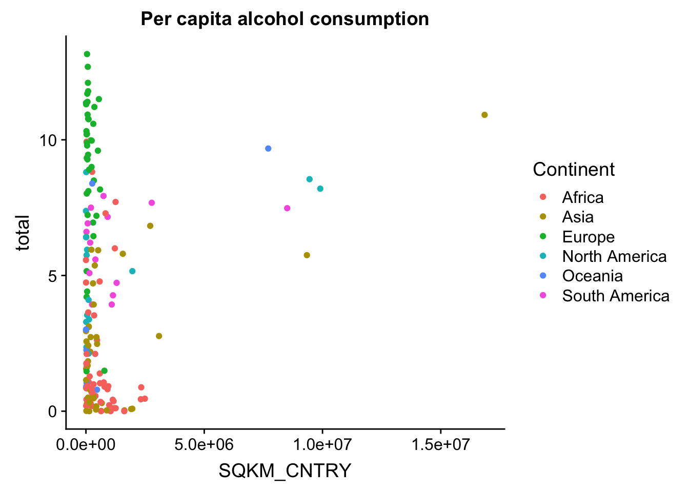
This basic scatterplot is kind of ugly and uninformative. The good news is this can be improved quite easily, and we can actually make a decent looking plot out of this! We’ll do this step by step.
Colour schemes
Our first step will be colour schemes. The easiest thing to do is to use the package RColorBrewer to generate a custom palette from a few nice looking options. With the function brewer.pal() you define how many colours you want (6 in our case, for 6 continents), and which palette you want (in this case we use a palette called “Set3” - see the documentation of brewer.pal() for all available palettes).
my.palette <- brewer.pal(6, "Set3")
p + scale_color_manual(values = my.palette)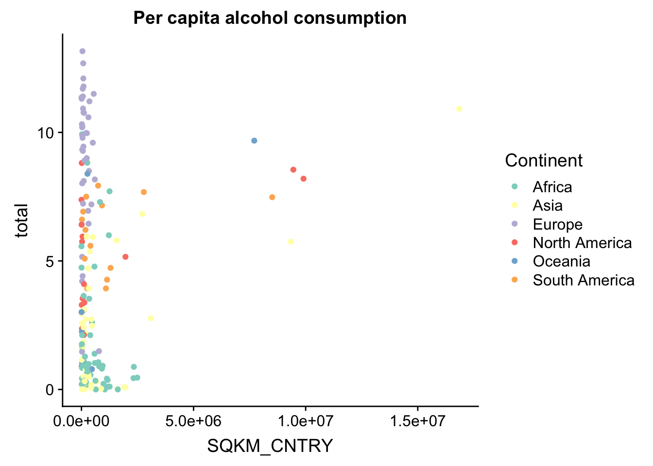
We can also generate custom colour palettes using online tools. There are many different online tools to generate colour palettes, and in this tutorial we will try one nifty one, found on this website: https://palettegenerator.com/ - this allows you to generate custom colour palettes from pictures you upload. Or you can use ready palets in the brew from this website https://moderndata.plot.ly/create-colorful-graphs-in-r-with-rcolorbrewer-and-plotly/
So we’ll use this one to make an epic Mad Max colour palette!
witness.me <- c("#DE8136", "#19191B", "#F6CAB1", "#533927", "#986039", "#166268")
p <- p + scale_color_manual(values = witness.me)
p
Remember: colour palettes can be subjective, and not everyone will find the same colour palettes attractive as you do. But custom colour palettes can be useful for creating a unique visual style, which can differentiate your plots from similar looking ones, and also create a consistent visual through-line in different plots in the same project. And don’t forget - when you’re preparing plots for publications, some of your audience may be colour-blind. Some journals will specifically ask for colour schemes that can be discerned by colour-blind people.
Theme layers
Theme layers are where you do most of your ggplot customization. theme() has a LOT of different arguments that let you change the way your plot looks. You can change the background, the axes, the gridlines, the fonts, the titles, and the legend. Modifying elements in the theme is simple, but notice that different elements inherit different functions. For instance, modifying text elements is done using element_text(), whereas modifying line elements is done using element_line(). The one exception is element_blank() - use this for (almost) any type of element that you want to remove from the plot completely. Here are a few useful examples:
p + theme(text = element_text(size = 25)) #change the font size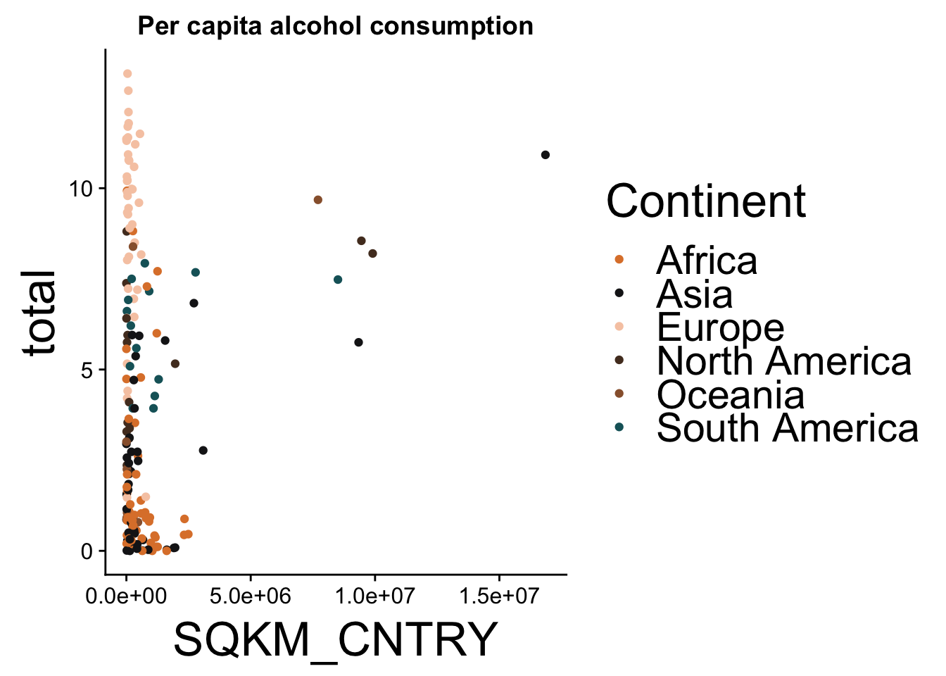
p + theme(text = element_text(family = "Comic Sans MS")) #change the font family (this is horrible, never use comic sans)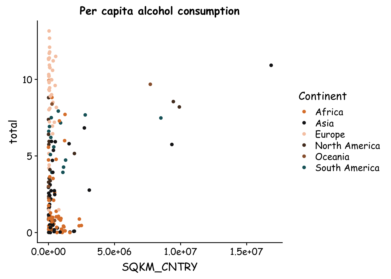
p + theme(panel.grid.major = element_line(colour = "grey")) #add gridlines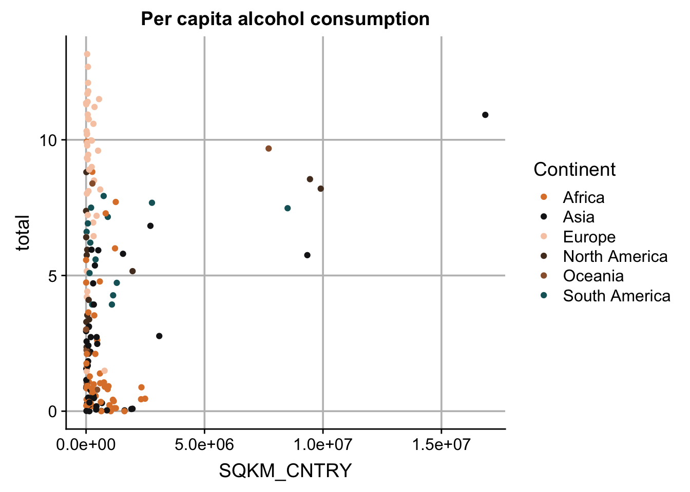
p + theme(panel.background = element_rect(fill = "black")) #change color of background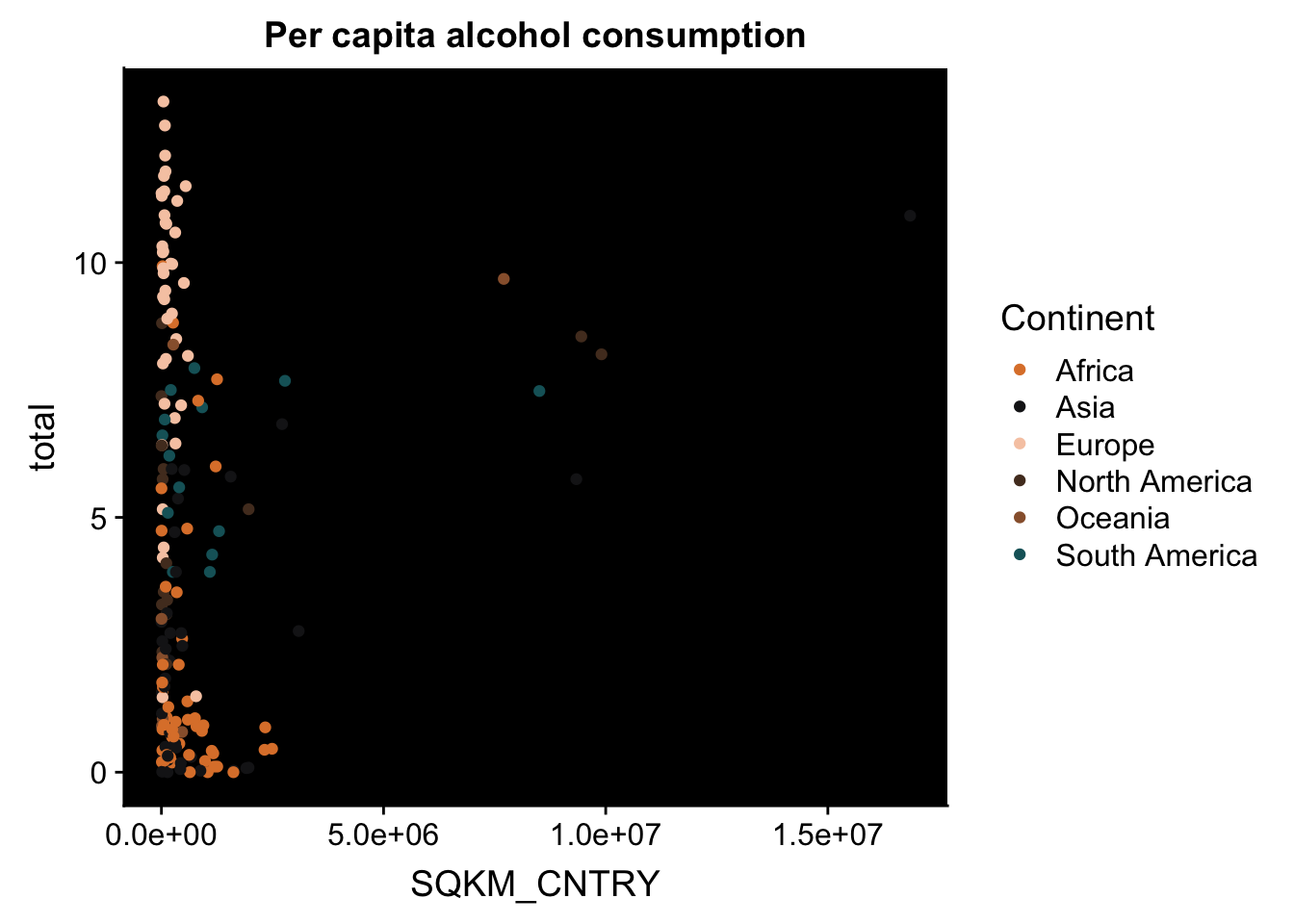
p + theme(axis.line = element_blank()) #remove axis lines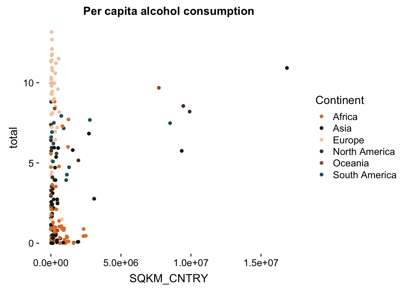
p + theme(panel.grid.major = element_line(colour = "grey"),
          panel.background = element_rect(fill = "black"),
          axis.line = element_blank()) #make several changes together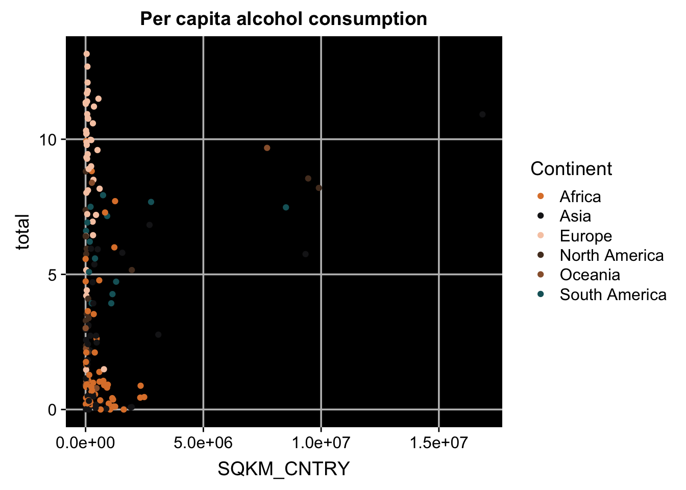
Legend manipulation
One of the most useful things you can do is to manipulate the legend. You can rename items in the legend, restyle it, move it around, or just delete it altogether.
p + theme(legend.position = "none") #remove the legend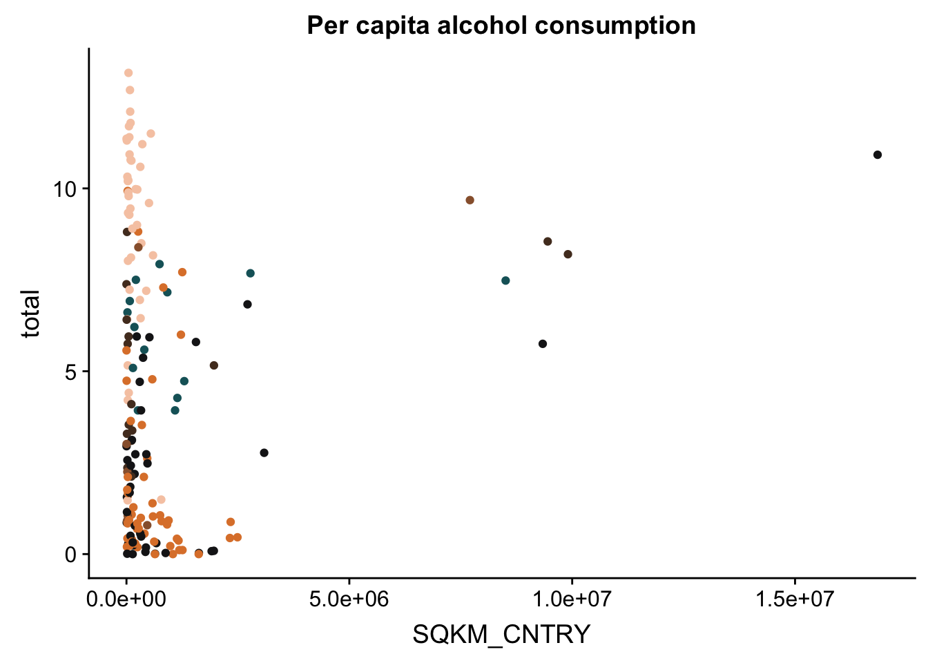
p + theme(legend.position = c(.1, .75)) #move the legend to a different position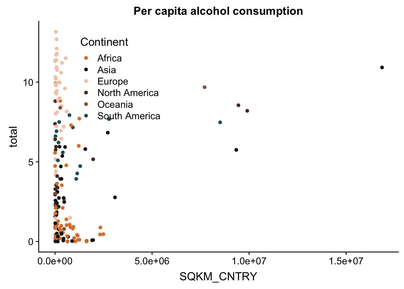
p + theme(legend.title = element_blank()) #remove the title of the legend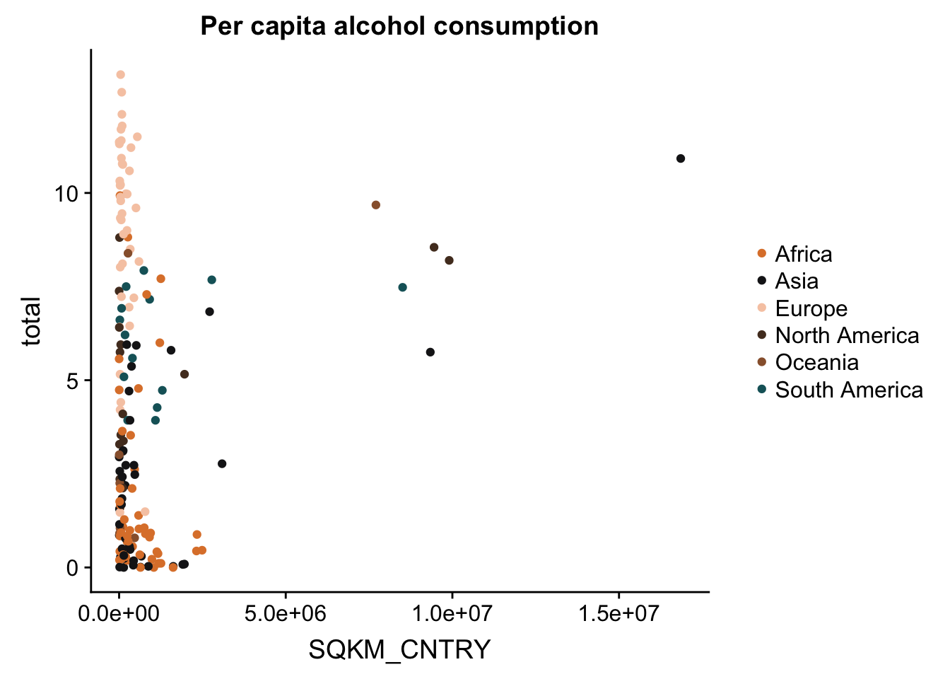
Axes manipulation
First of all, it’s about time we do something about our ugly data. One of our main issues is that the country areas (on the X axis) should be log-transformed. We can transform our data using a simple line of code, and some functions from the scales package. Here are some examples, but make sure to check the trans() function documentation and pick the type of transformation that fits your data!
p + scale_x_continuous(trans = log10_trans()) #log10 transformation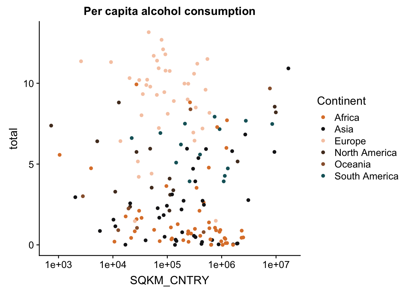
p + scale_x_continuous(trans = sqrt_trans()) #square-root transformation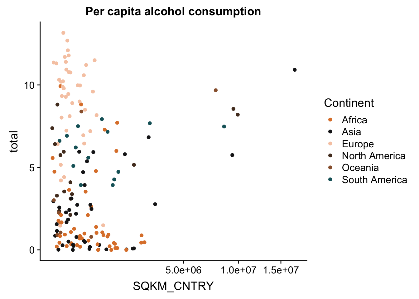
p + scale_x_continuous(trans = reverse_trans()) #reverse transformation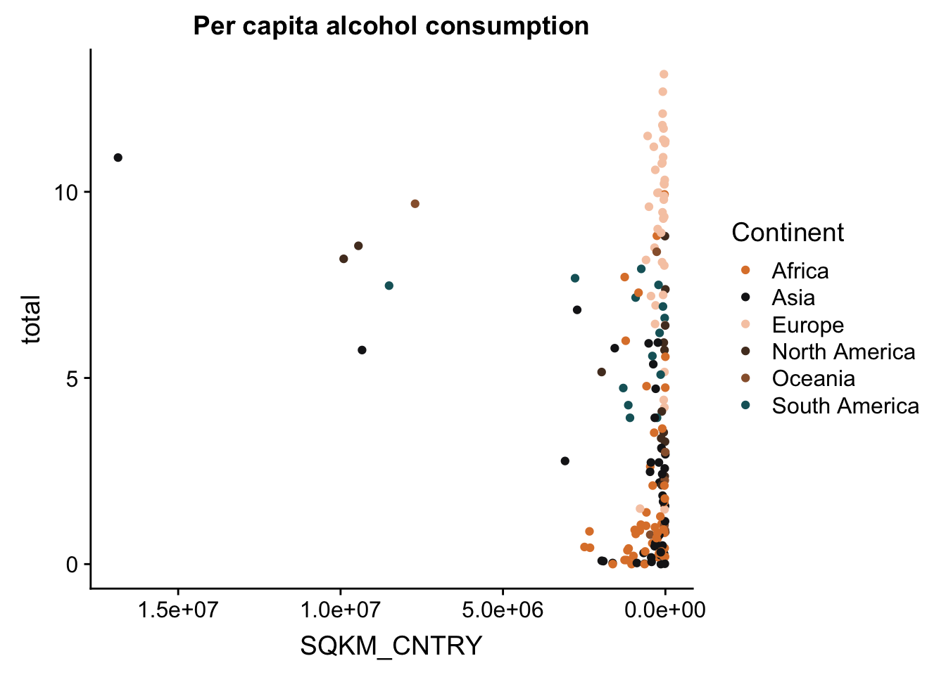
And to make this look a bit better, let’s change the tick labels to have actual numbers. We’ll do this with the trans_format() function. We tell the function which transformation to apply to the numbers, and the format in which to write the labels.
p <- p + scale_x_continuous(trans = log10_trans(),
                            labels = trans_format("log10", math_format(10^.x)))
p
You may also want to change the titles of your axes - this is always useful because usually your data will have column names that are short and easy to type, but less informative for a plot you want to publish. The expression() function (from base R) is useful for this, because it allows you to add special characters, as well as create super- and subscripts, italics, etc.
p <- p + labs(x = expression("Area (km"^"2"~")"),
              y = expression("Consumption (l"/"y"~")"))
p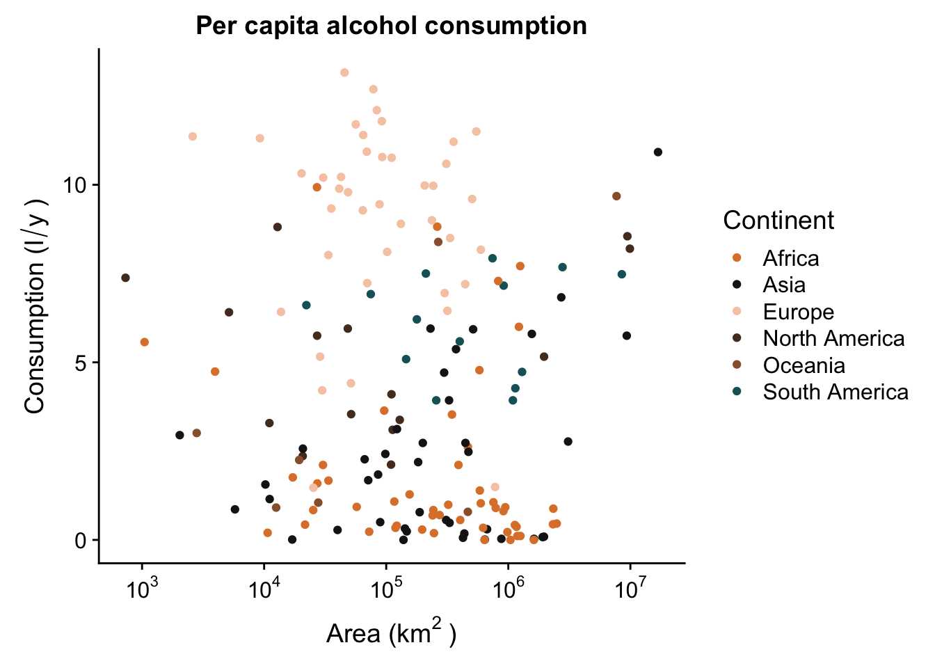
Labels ggrepel
One thing you can do is add labels to the data points in your plot. If, for instance, you want to know which country each observation in the scatterplot is. For this, you need to map a label aesthetic, and add a geom_text(). We’ll use a smaller subset of the data, limited only to Asia, to show how it’s done.
data_europe <- data_vis %>% subset(Continent == "Europe")
p_lab <- ggplot(aes(x = SQKM_CNTRY,
                y = total,
                label = CNTRY_NAME),
            data = data_europe) +
  geom_point(colour = "grey50") +
  scale_x_continuous(trans = log10_trans(),
                            labels = trans_format("log10", math_format(10^.x))) +
  labs(x = expression("Area (km"^"2"~")"),
              y = expression("Consumption (l"/"y"~")")) +
  ggtitle("Per capita alcohol consumption")
p_lab + geom_text()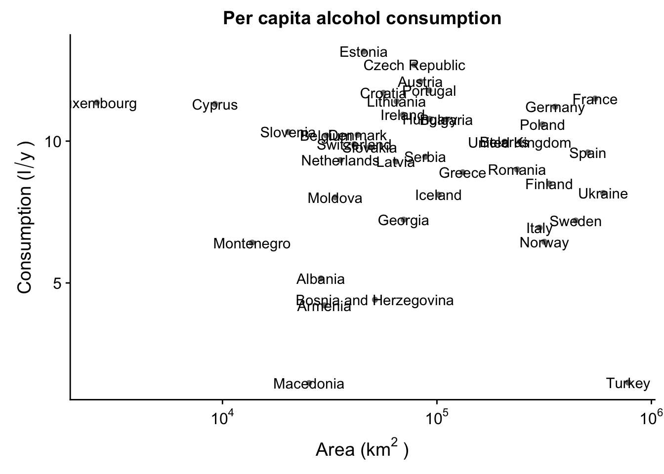
Obviously, this is a bit of a mess. Luckily, we can use the ggrepel package to create text labels that are easily manipulated. We then use geom_text_repel() instead of the regular geom_text() - this will make sure the labels are not overlapping.
p_lab + geom_text_repel()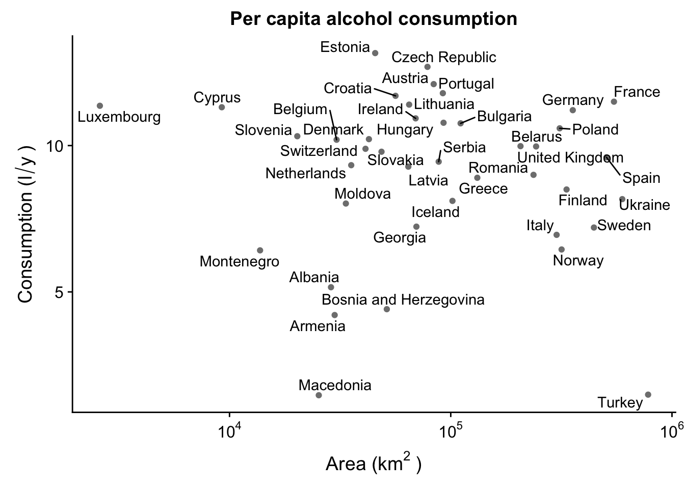
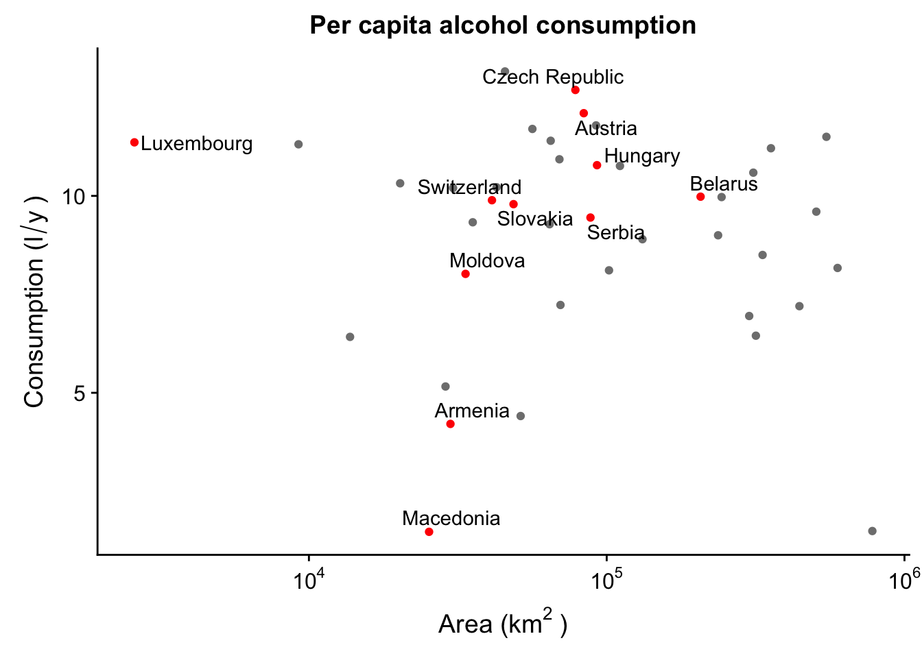
Already this looks beter, but we can improve this even more! There’s all sorts of customization we can do with ggrepel. For instance, let’s say we’re only interested in labeling some of the countries, and not others. For instance, only landlocked countries.
p_lab <- ggplot(aes(x = SQKM_CNTRY,
                y = total,
                label = CNTRY_NAME),
            data = data_europe) +
  geom_point(colour = ifelse(data_europe$LANDLOCKED == "Y", "red", "grey50")) + #this makes sure to colour only the selected observations
  scale_x_continuous(trans = log10_trans(),
                            labels = trans_format("log10", math_format(10^.x))) +
  labs(x = expression("Area (km"^"2"~")"),
              y = expression("Consumption (l"/"y"~")")) +
  ggtitle("Per capita alcohol consumption")
p_lab + geom_text_repel(data = subset(data_europe,
                                      LANDLOCKED == "Y"), #this makes sure to only label the selected observations
                        force = 1
                        )
We can also move the labels. For instance, let’s move them all to the top of the plot. We’ll also need to rescale the y axis to leave enough space for the labels.
p_lab + geom_text_repel(data = subset(data_europe,
                                      LANDLOCKED == "Y"),
                        nudge_y = 15 - subset(data_europe,
                                      LANDLOCKED == "Y")$total,
                        segment.colour = "grey50",
                        direction = "x",
                        force = 1
                        ) +
  scale_y_continuous(limits = c(NA, 15))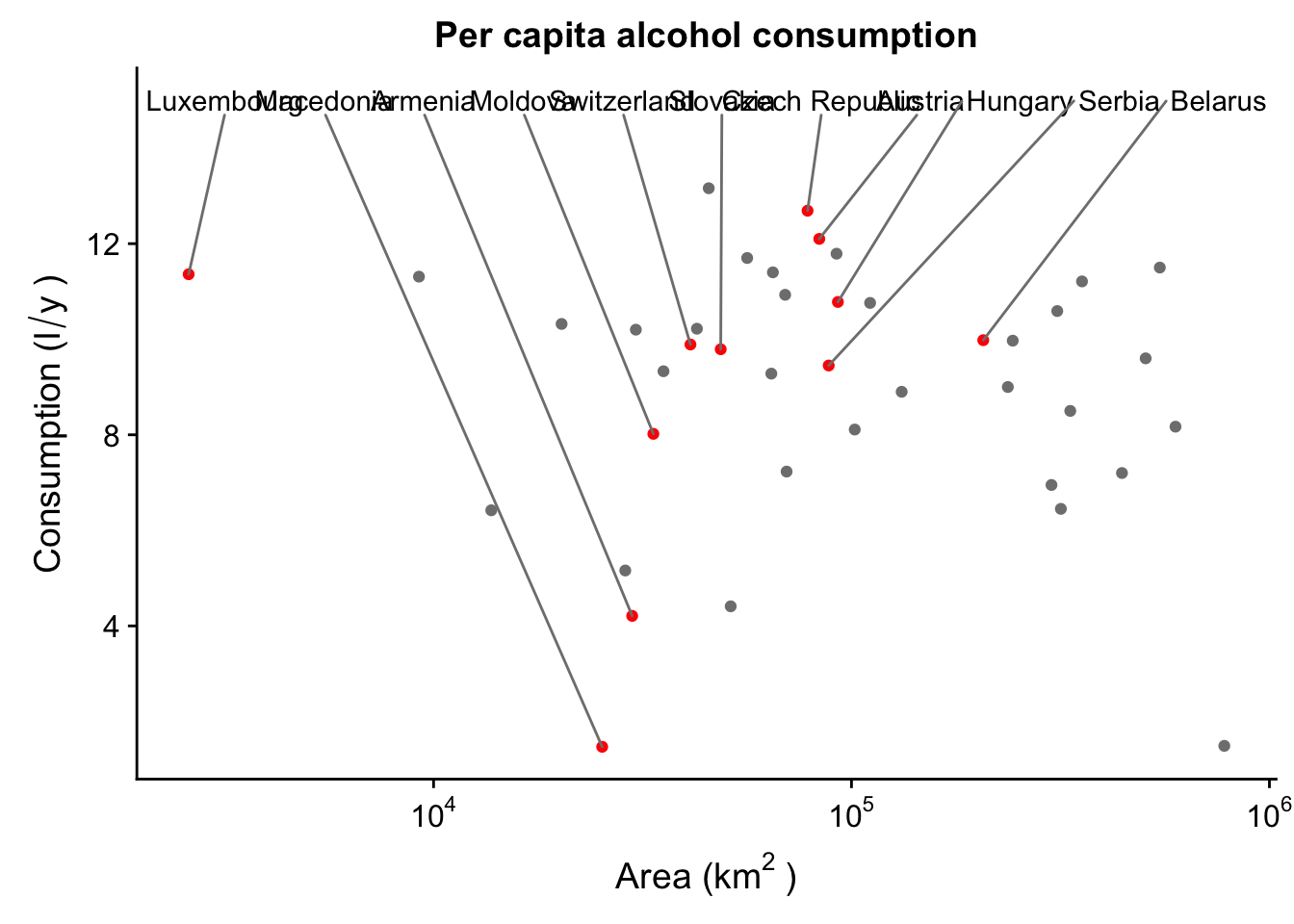
Facets, rotations, etc.
Now we can deal with another problem - this plot is a bit cluttered. It’s hard to tell the different continents from one another, which makes it difficult to identify trends. We can solve this via facetting - this is a cool tool that allows us to break up our one plot into several similar plots - they all have the same axes, but they are separated by the chosen factor (continents in this case).
p + facet_grid(Continent ~ .) #facet in the vertical direction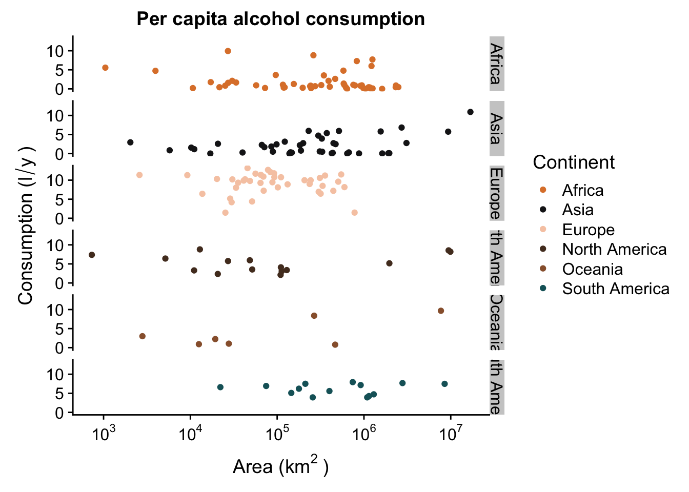
p + facet_grid(. ~ Continent) #facet in the horizontal direction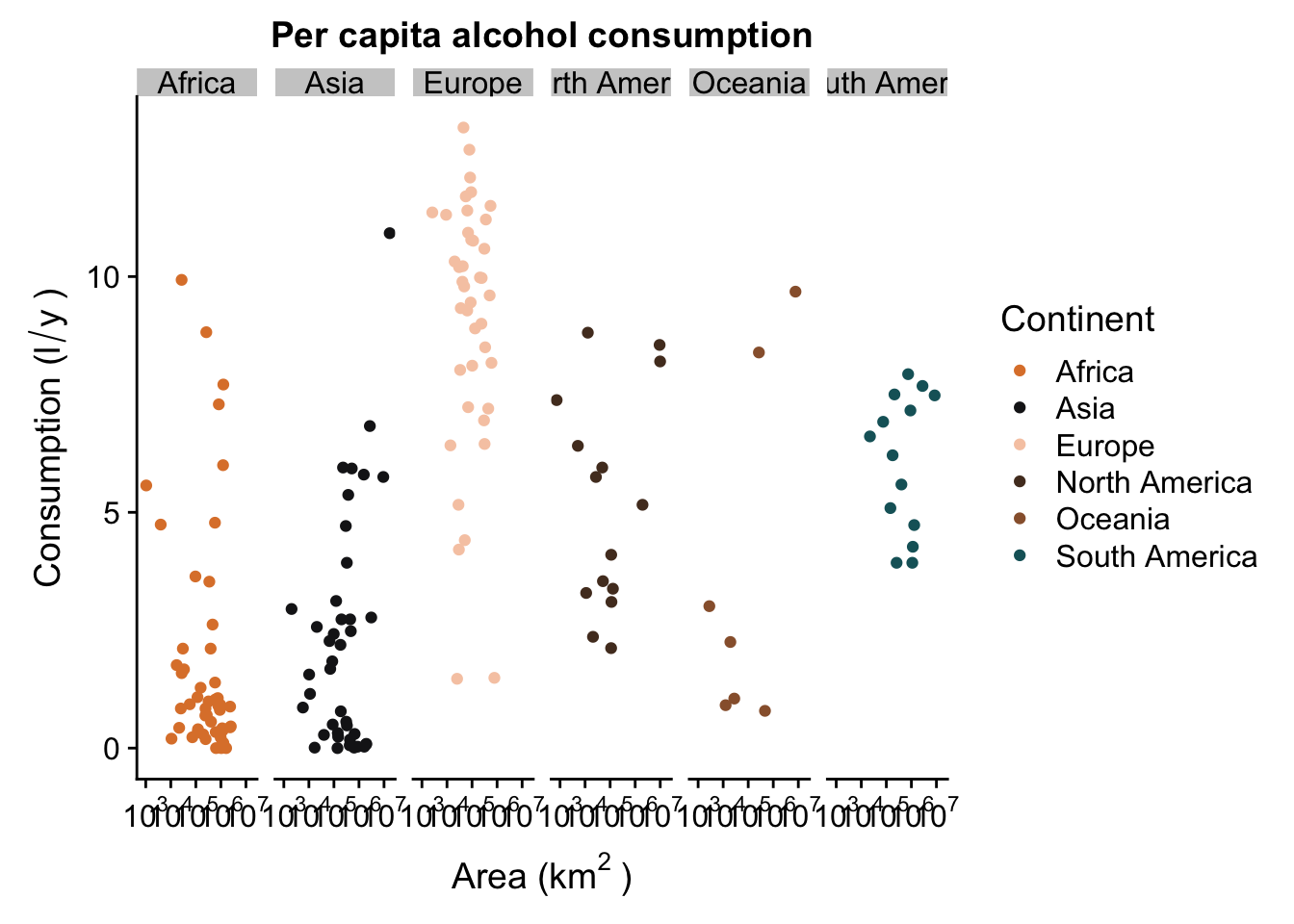
p + facet_wrap( ~ Continent,ncol = 3) #facet in a grid, with a set number of columns (or rows)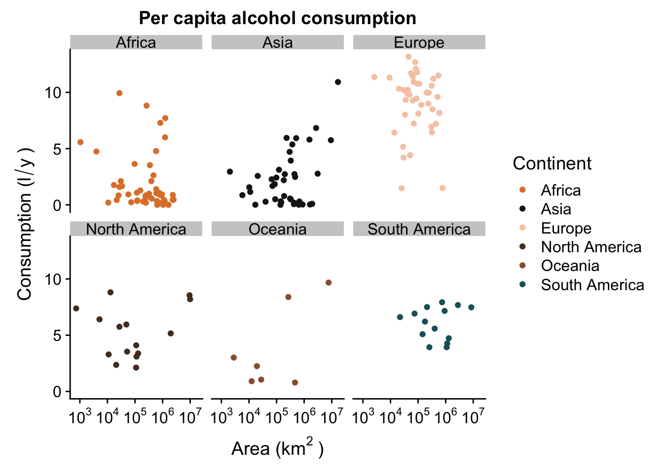
Your plot doesn’t have to be facetted by a factor that you’ve mapped. For instance, we can facet our plot by the factor ISLAND, even though it has no aesthetic mapped to it:
p + facet_grid(. ~ ISLAND)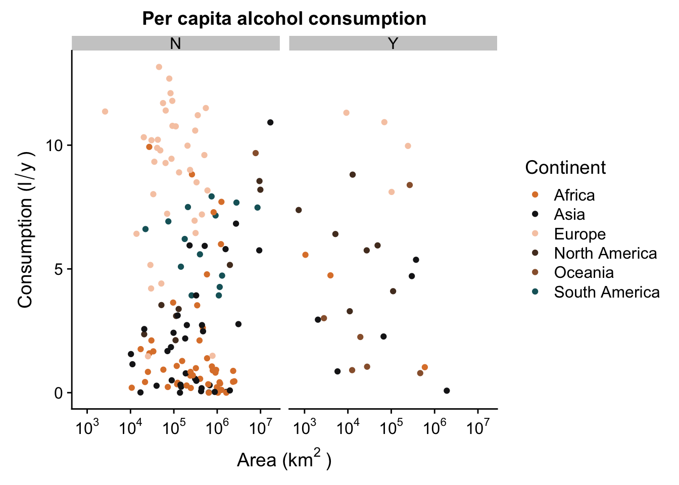
We’ve now managed to generate a pretty nice looking plot. You’ll see that we all facets have the same range of values in their axes - this allows us to compare the scatterplots in the different levels of our factor (continent), but because they are each in a different “plot”, it’s a lot less messy and we can see where there is no trend (Europe) and where they might be something going on (Asia).
Remember: facets can be very useful, but sometimes they can be detrimental. For instance, if you want to show that your trends DO NOT differ between different levels of a factor, it may be easier to show how they overlap without using facetting.
Now let’s try to do something a bit more interesting. Let’s try to generate a different plot that allows us to check for differences in alcohol consumption between continents, without taking into acount area. We’ll do this using a violin plot, which is a slightly fancier and more informative version of a boxplot. We’ll use the same colour palette as we did for the scatterplot.
p2 <- ggplot(aes(x = Continent,
                 y = total,
                 fill = Continent),
             data = data_vis) +
  geom_violin(trim = F) +
  geom_boxplot(width = .1) +
  geom_jitter(height = 0,
              width = .1,
              alpha = .2) +
  scale_fill_manual(values = witness.me) +
  theme(panel.grid = element_blank(),
        axis.line = element_line(colour = "black")) +
  labs(x = "Continent",
       y = expression("Consumption (l"/"y"~")")) +
  ggtitle("Per capita alcohol consumption")
p2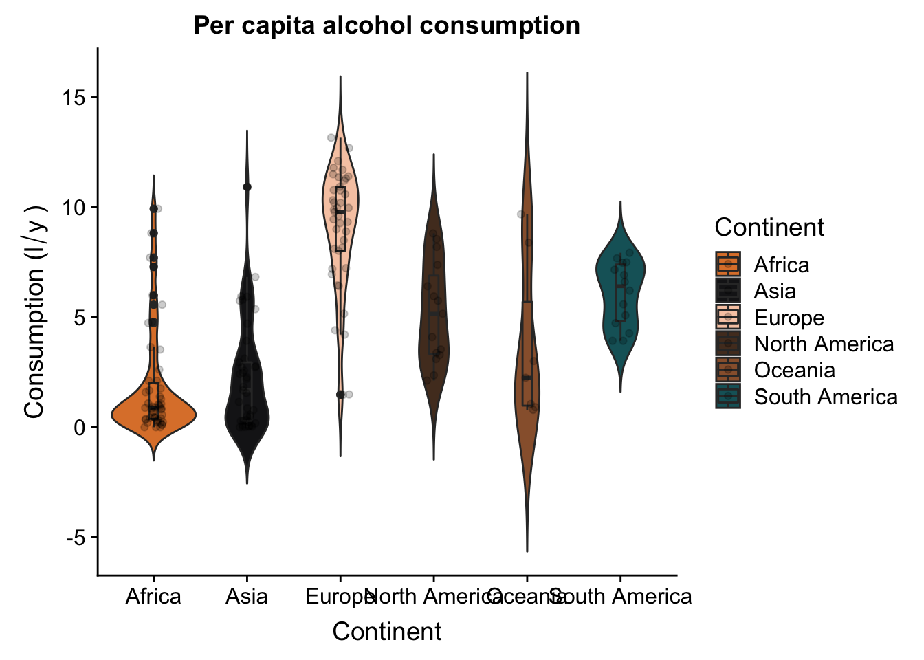
Now let’s try and combine these two plots - we want to put them both together, side by side. First thing we’ll do is rotate our violin plot. This is very easily done:
p2 + coord_flip()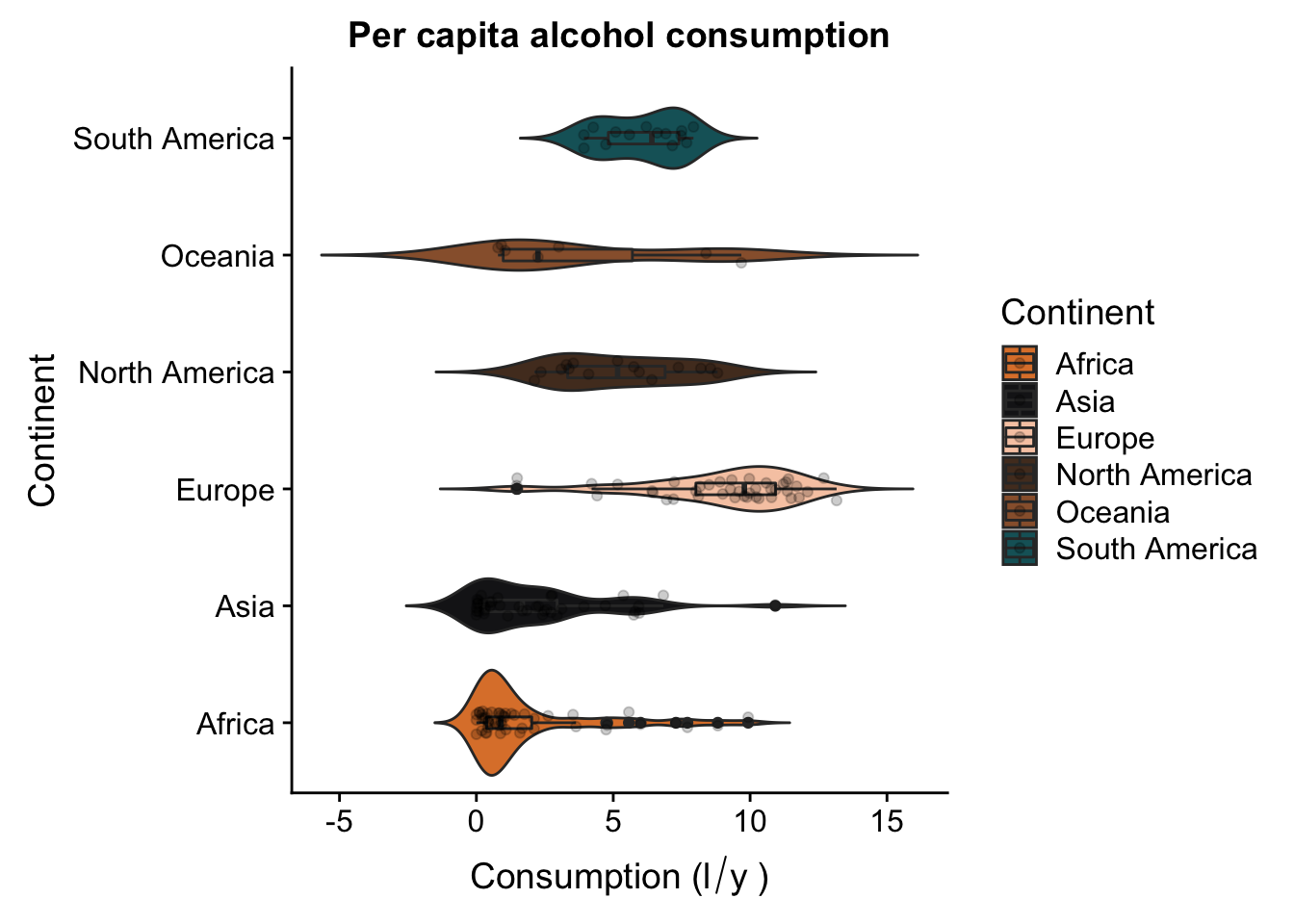
Now, we’ll use the plot_grid() function from the package cowplot to draw the two plots side by side.
p <- p + facet_grid(Continent ~ .) +
  theme(legend.position = "none",
        strip.background = element_blank(),
        strip.text = element_blank())
p2 <- p2 + coord_flip() +
  theme(legend.position = "none",
        axis.title.y = element_blank(),
        plot.title = element_text(colour = "white")) +
  scale_x_discrete(limits = rev(levels(data_vis$Continent)))
p3 <- plot_grid(p, p2, ncol = 2)
p3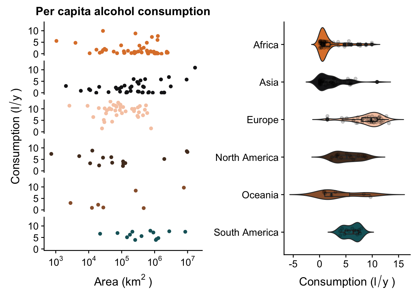
Export
Finally, it’s time to export our plot. There are several formats basic R can export to, the most useful of which are probably JPG, PNG and PDF. The code for them all follows the same basic format.
jpeg("myplot.jpg")
p3
dev.off()
## quartz_off_screen
## 2png("myplot.png")
p3
dev.off()## quartz_off_screen
## 2pdf("myplot.pdf")
p3
dev.off()## quartz_off_screen
## 2High quality files
As you’ve probably noticed, while the PDF file looks ok, the JPG and PNG are really poor quality. However, we can fix this. For instance, we can create a TIFF file with a higher dpi and larger dimensions. Also, we can change the size of the PDF, or export to other, different file formats.
tiff("myplot.tiff", height = 20, width = 20, units = "cm", res = 300)
p3
dev.off()
## quartz_off_screen
## 2pdf("myplot.pdf", height = 20, width = 20)
p3
dev.off()## quartz_off_screen
## 2Tip: pdf() is super useful! The function has arguments to e.g. change the font family, combine different plots to a single file, choose the target paper size, etc. It’s highly recommended to check the function documentation!
ggpubr
After we learned all this the hard way, let’s learn the easy way. The ggpubr package is the simple way to create nice looking plots. ggpubr basically compressed all of the different ggplot functions (geoms, themes, scales, etc.) into a single function - there’s a different function for different geoms (e.g. ggboxplot() or gghistogram()), and all of the different theme options etc. are written as arguments in the function. For instance, we can recreate our violin plot using just one line of code.
ggviolin(data_vis,
         x = "Continent",
         y = "total",
         fill = "Continent",
         palette = witness.me,
         add = c("boxplot", "jitter"),
         ylab = expression("Consumption (l"/"y"~")"),
         rotate = T,
         add.params = list(alpha = .2))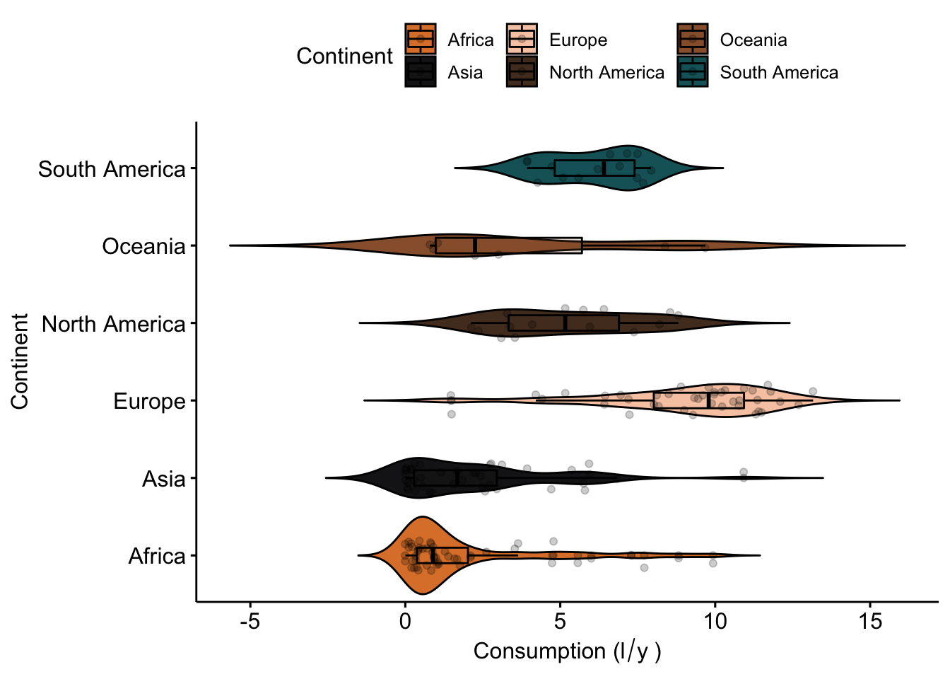
ggpubr has similar types of functions for different types of plots (scatterplots, boxplots, etc.). All look lovely, and require a lot less hassle to generate. It’s a package well worth exploring. Here a few examples of the types of plots you can generate with ggpubr:
#density plots
ggdensity(data_vis,
          x = "total",
          color = "Continent",
          fill = "Continent",
          palette = witness.me,
          facet.by = "Continent",
xlab = expression("Consumption (l"/"y"~")")) 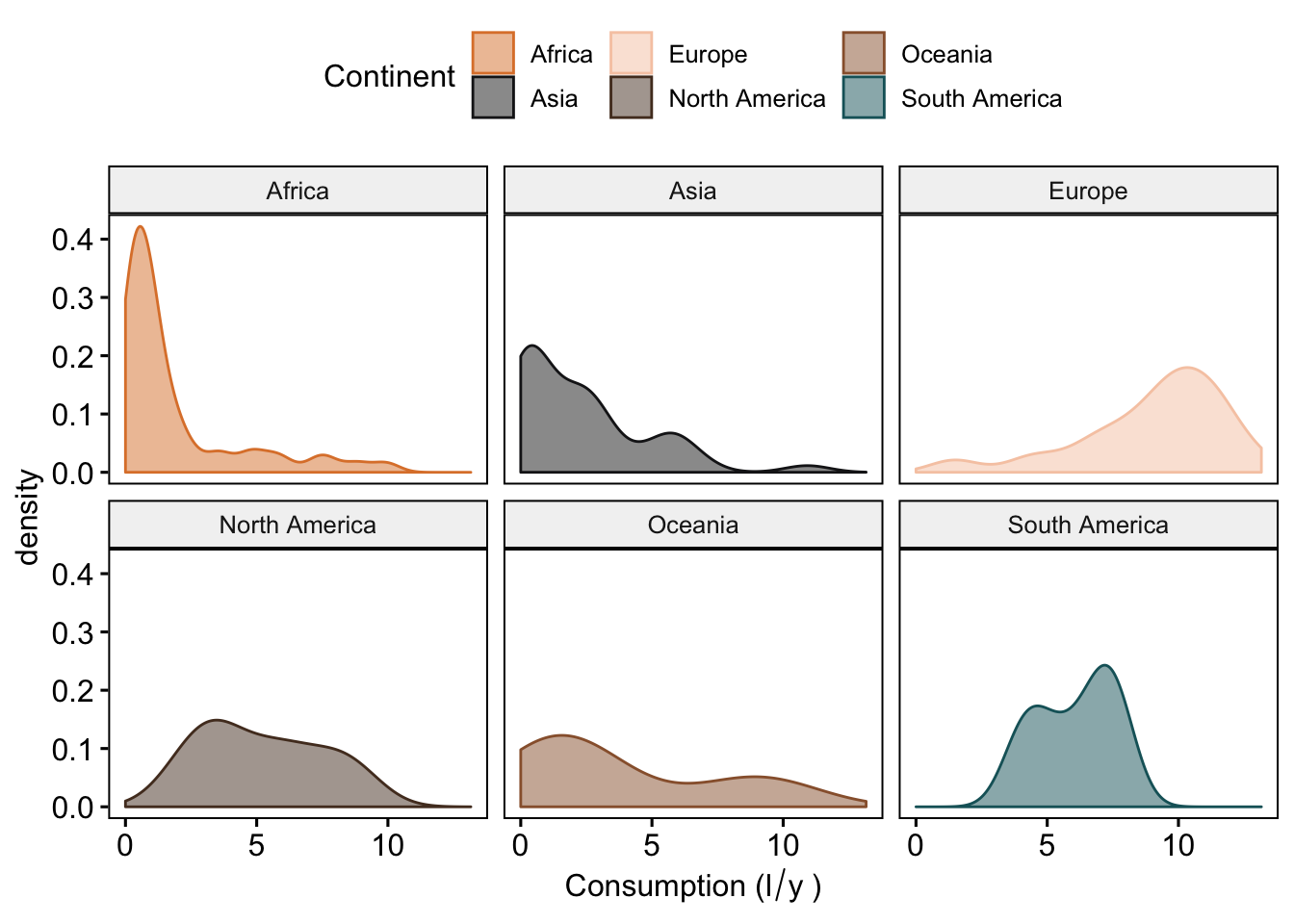
#we can also mark the mean (or medians) and add tickmarks (rug = T) to show the actual values of the observations
ggdensity(data_vis,
          x = "total",
          add = "mean",
          rug = T,
          color = "Continent",
          fill = "Continent",
          palette = witness.me,
          facet.by = "Continent",
xlab = expression("Consumption (l"/"y"~")")) 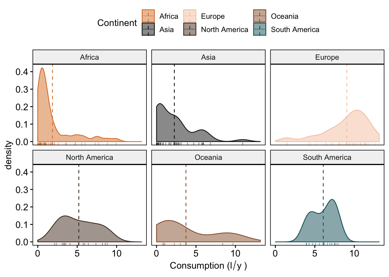
#ordered bar plots
ggbarplot(data_vis,
          x = "CNTRY_NAME",
          y = "total",
          color = "Continent",
          fill = "Continent",
          palette = witness.me,
          sort.val = "desc",
          sort.by.groups = F,
          x.text.angle = 90,
          ylab = expression("Consumption (l"/"y"~")"),
          xlab = "Country") +
  font("x.text", size = 4)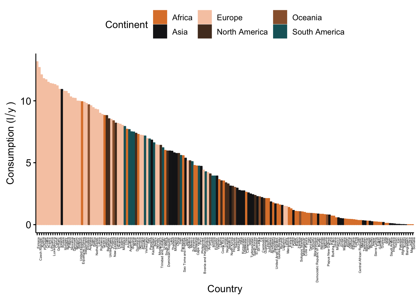
#Lollipop chart, as an alternative to barplot
ggdotchart(data_vis,
           x = "CNTRY_NAME",
           y = "total",
           color = "Continent",
           palette = witness.me,
           sorting = "descending",
           rotate = T,
           group = "Continent",
           add = "segments",
           ylab = expression("Consumption (l"/"y"~")"),
           xlab = "Country") +
  font("y.text", size = 4)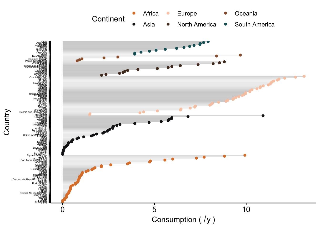
But really, the best way to learn is to just play around with the package and see what it’s capable of.
EXCERCISE
Now it’s your turn to try! We want to know if island nations are home to heavier drinkers - in all three different categories (beer, wine, spirits). So your task is to visualize differences between island and mainland countries in all three of these, in a single plot. HINT: don’t forget patterns of consumption differ between continents! Use whichever visualization method you are most comfortable with, and you think will display the data best for the question we want to ask. Don’t forget - visualization is as much design as it is coding! Try to make your figure clear and concise, but also visually appealing. Try to please your own sense of aesthetic first!
Interactive visualization
In this part we will learn how to create interactive plots and how to use them online, in presentations, or in Rmd files for reporting our results.
plotly
Introduction
plotly is a great cross-platform package, originating in JavaScript (JS) form, that allows a lot of options for plotting interactive plots. We will use the R version of the package. It can be used in two ways. The simplest usage of the package is to use ggplotly(), which transforms ggplot objects to interactive visualizations. This is done with the code
#create a ggplot object
p <- ggplot(aes(x = SQKM_CNTRY, y = total, colour = Continent), data = data_vis) + geom_point() + ggtitle("Per capita alcohol consumption") + scale_colour_manual(values = witness.me) + scale_x_continuous(trans = log10_trans())
p
#transform into an interactive object
ggplotly(p)
The second option is to transfer data into an interactive object. This is done with the plot_ly() function. This function was originally designed to create plots that were not available with ggplot such as 3D and mash plots. However, today you can create any plot with this function, and the majority of ggplot objects can be transformed into a plotly object.
We will learn a bit about the plot_ly() syntax for you to be able to use the power of the JS library in R.
plot_ly() syntax
This function is extremely versatile and it allows you to control and change every small thing on the plot. The plot_ly() function uses the pipe symbol %>% to add traces, which are equivalent to geom in ggplot and describe the type of plot you want, and layers which are anything you want to change or add to the the type of plot. Scatter is the default type. Let’s look at the most basic plot_ly() plot: Litres of beer consumed as a function of country area
plot_ly(data_vis,x=~log10(SQKM_CNTRY),y=~beer, type = 'scatter')Adding color
Now lets add a discrete variable to use as color variable in the plot. We’ll use island (yes or no) as a factor
plot_ly(data_vis,x=~log10(SQKM_CNTRY),y=~beer, type = 'scatter',color =~ ISLAND)We can change the colors to what we want
plot_ly(data_vis,x=~log10(SQKM_CNTRY),y=~beer, type = 'scatter',color =~ISLAND,colors = "Set1")Legend position
We can change the legend position
#legende bottom
plot_ly(data_vis,
        x=~log10(SQKM_CNTRY),
        y=~beer,
        type = 'scatter',
        color =~ISLAND,
        colors = "Set1") %>%
   layout(legend = list(orientation = 'h'))
#legend witin plot
plot_ly(data_vis,
x=~log10(SQKM_CNTRY),
y=~beer,
type = 'scatter',
color =~ISLAND,
colors = "Set1") %>%
layout(legend = list(x = 0.1, y = 0.9))#no ledgend
plot_ly(data_vis,
x=~log10(SQKM_CNTRY),
y=~beer,
type = 'scatter',
color =~ISLAND,
colors = "Set1") %>%
layout(showlegend = FALSE)Change axis names
plot_ly(data_vis,
        x=~log10(SQKM_CNTRY),
        y=~beer,
        type = 'scatter',
        color =~ISLAND,
        colors = "Set1") %>%
layout(legend = list(x = 0.1, y = 0.9),
       xaxis = list(title = "where in the world",
                    titlefont = list(family = "Comic Sans MS",size = 18)),
       yaxis = list(title = "Beer consumption",
                    titlefont = list(family = "Courier New, monospace", size =30)))
A cleaner way to do the same
#first font
f1 = list(family = "Comic Sans MS",size = 18)
#second font
f2 = list(family = "Courier New, monospace", size =30)
#xaxis
x = list(title = "where in the world", titlefont = f1)
#yaxis
y = list(title = "Beer consumption", titlefont = f2)

#make the plot
plot_ly(data_vis,
        x=~log10(SQKM_CNTRY),
        y=~beer,
        type = 'scatter',
        color =~ISLAND,
        colors = "Set1") %>%
layout(legend = list(x = 0.1, y = 0.9),
       xaxis = x,
       yaxis = y)
Plot side by side
We can plot side by side each level in the discrete variable. Make sure that the data you want to plot are in a long format.
p <- data_vis %>%
  #transform the variable that will be used to plot to integer type
  transform(id = as.integer(factor(LANDLOCKED))) %>%
  #plot the data where X is the predictor, y is the response, color is thedivider, yaxis is the variable to use to divide the plot
  plot_ly(x = ~total, y = ~beer, color =~LANDLOCKED, colors = "Dark2",
          yaxis = ~paste0("y", id)) %>%
  # define the number of subplots and share the x to plot them together
  subplot(nrows = 2, shareX = TRUE)
p
Line plot in subplot
We can plot lines connecting all the observations instead of dots by removing the “scatter” as type and adding the line add_lines()
p <- data_vis %>%
  #transform the variable that will be used to plot to integer type
  transform(id = as.integer(factor(LANDLOCKED))) %>%
  #plot the data where X is the predictor, y is the response, color is thedivider, yaxis is the variable to use to divide the plot
  plot_ly(x = ~total, y = ~beer, color = ~LANDLOCKED, colors = "Dark2",
          yaxis = ~paste0("y", id)) %>%
  #make a line graph instead of just scatterplot
  add_lines() %>%
  # define the number of subplots and share the x to plot them together
  subplot(nrows = 2, shareX = TRUE)
p
Change the size of the dots based on a variable
#change size for all dots
p<- plot_ly(data_vis,
        x=~log10(SQKM_CNTRY),
        y=~wine,
        type = 'scatter',
        color =~LANDLOCKED,
        colors = "Set1",
        mode = "markers",
        marker = list(size = 20)) %>%
  layout(showlegend = FALSE)
p
#change size based on a continious factor
p<- plot_ly(data_vis,
x=~log10(SQKM_CNTRY),
y=~log10(POP_CNTRY),
type = 'scatter',
mode = "markers",
size = ~total,
color =~LANDLOCKED,
colors = "Set1") %>%
layout(showlegend = FALSE)
pLine plots
plot_ly(data_vis, x = ~log10(POP_CNTRY), y = ~log10(SQKM_CNTRY)) %>%
  add_lines(color = ~LANDLOCKED, colors = "Set1", alpha = 0.9)
Barplot
p2 <- data_vis %>%
  dplyr::count(Continent) %>%
  plot_ly(x = ~Continent, y = ~n) %>%
  add_bars()
p2
Proportion barplot
# number of wines by continent and whether its and island (n)
cc <- count(data_vis, Continent, ISLAND)
# number of diamonds by Continent (nn)
cc2 <- left_join(cc, count(cc, Continent, wt = n))
cc2 %>%
  mutate(prop = n / nn) %>%
  plot_ly(x = ~Continent, y = ~prop, color = ~ISLAND) %>%
  add_bars() %>%
  layout(barmode = "stack")
Boxplot
#Standard boxplot
p <- plot_ly(data_vis, y = ~total, color = I("darkgreen"),
             boxpoints = "suspectedoutliers")%>%
  add_boxplot(x = ~Continent)
p
#faceted boxplot
p<- plot_ly(data_vis, x = ~wine, y = ~interaction(ISLAND, Continent)) %>%
add_boxplot(color = ~ISLAND) %>%
layout(yaxis = list(title = ""), margin = list(l = 100))
pExporting locally as html widget
This can be used in a website or presentation
htmlwidgets::saveWidget(p, "my_plot.html")Export static
To export a high quality static plot from plot_ly() you need to install an additional package for your OS names orca. Follow this github to unstall it: https://github.com/plotly/orca#installation Then write
# orca(p, file='image.png',width = 10,height = 10)To summarize plotly
Pros: A strong tool for interactive ploting especially if you want to use Shiny. Also has the ggplotly option that converts all ggplots to interactive ones. Cons: Syntax is not intuitive and needs some time to get used to if you don’t know JS
ggvis
ggvis is a good alternative to plotly and to ggplot because the structure of the object is similar to ggplot2 but with %>% instead of +. To use the package we will use ggvis(). We will show here a few examples of how to use ggvis and in the end you can find a list of links that can be useful to deepen your understanding of the package.
The basic ggvis() plots are static just like ggplot, but perhaps need less writing to produce.
Scatterplot
We’ll start with a scatterplot
p<- data_vis %>%
  ggvis(x =~log10(POP_CNTRY),y =~spirits) %>%
  layer_points()
pAdding variables to plot
You can add more variables to the plot by mapping them to other visual properties: fill = color stroke= color palette size = size of the symbols shape= shape of the symbols
data_vis %>%
  ggvis(x =~log10(POP_CNTRY),
        y =~spirits,fill=~Continent,size =~wine,shape =~ISLAND) %>%
layer_points()To use a fixed color or size instead of a variable, use :=
data_vis %>%
  ggvis(x =~log10(POP_CNTRY),y =~spirits,fill:="red",size :=30,shape :="square") %>%
layer_points()Add grouping with group_by()
data_vis %>%
ggvis(x = ~wine, y = ~beer) %>%
  layer_points(fill = ~Continent) %>%
  group_by(Continent) %>%
  layer_model_predictions(model = "lm",se = T)
## Guessing formula = beer ~ wineFix legend
data_vis %>%
ggvis(x = ~wine, y = ~beer) %>%
  layer_points(fill = ~Continent,size =~total) %>%
  group_by(Continent) %>%
 add_legend(c("size", "fill"),
orient = "left")Histogram
data_vis %>%
  ggvis(~spirits,fill:="darkgreen") %>%
  layer_histograms()
## Guessing width = 0.2 # range / 34Barplot
data_vis %>%
  ggvis(~log10(POP_CNTRY), ~wine) %>%
layer_bars(width = 0.04)Line plot
data_vis %>%
  ggvis(~log10(POP_CNTRY), ~log10(SQKM_CNTRY)) %>%
layer_lines()Boxplot
data_vis %>%
  ggvis(x=~Continent, y=~wine,fill:="darkblue") %>%
layer_boxplots()Make the plot interactive
ggvis gives an option of interactive plotting. It is different from the interactive plotting in plotly but maybe useful for other things.
Change symbol size
For example we can allow the user to change the size of the points and the transperacy using a slider
#add sliders to the size and the opacity
data_vis %>%
  ggvis(x =~log10(POP_CNTRY),
        y =~spirits,
        fill:="red",
        size := input_slider(10, 300),
        opacity := input_slider(0, 1)
        ) %>%
  layer_points()
## Warning: Can't output dynamic/interactive ggvis plots in a knitr document.
## Generating a static (non-dynamic, non-interactive) version of the plot.Input a check box
model_type <- input_checkbox(label = "Use flexible curve",
  map = function(val) if(val) "loess" else "lm")
ggvis(data = data_vis,x=~total, y=~spirits) %>%
layer_model_predictions(model = model_type)Summary
ggvis is a good tool to create plots in R and is in some ways similar to ggplot2 Pros: Uses less lines than ggplot to create the same plot Cons: Has less documentation and forums which makes it a bit harder to learn
Here is a good comparison review of ggplot2 vs. ggvis and the difference between them https://stats.stackexchange.com/questions/117078/for-plotting-with-r-should-i-learn-ggplot2-or-ggvis/117080
Here is a good comparison between the different available packages for plotting in R http://ouzor.github.io/blog/2014/11/21/interactive-visualizations.html
Geographic plotting
We can plot two types of geographical plots in R - static (ggplot2) and interactive (leaflet). There are some more packages out there - you can find some links in the end of this section.
ggplot2
Manipulating the data
To plot geographical data with ggplot you first need to change the structure of the data. We will use the shapefile data_vis.sp that we created previously.
To use the shapefile in ggplot2 we have to first fortify the spatial attribute of our data and then join the metadata back to the new spatial data
#save the metadata in a new object
data_vis.sp_d<- data_vis.sp@data
#fortify the data use the ID column as region
data_vis.sp_f <- fortify(data_vis.sp, region = "ID") %>%
  mutate(id = as.numeric(id))
# now we join the thematic data
map_data <- data_vis.sp_f %>% left_join(data_vis.sp_d, by = c("id" = "ID"))
Basic map
p <- ggplot() +
    # municipality polygons
    geom_polygon(data = map_data, aes(fill = beer,
                                      x = long,
                                      y = lat,
                                      group = group)) +
    # municipality outline
    geom_path(data = map_data, aes(x = long,
                                   y = lat,
                                   group = group),
              color = "white", size = 0.1) +
    coord_equal() +
    # add the previously defined basic theme
    theme_map() +
    labs(x = NULL,
         y = NULL,
         title = "Beer consumption around the world",
         subtitle = "Litres consumed per capita"
         )
p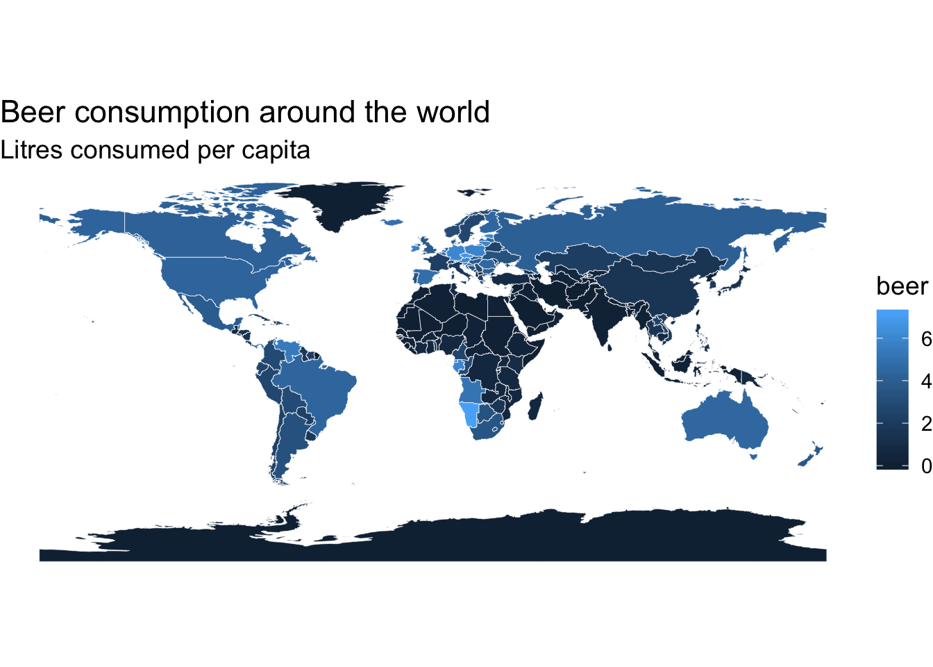
#change the color to have a nicer color scheme
p+scale_fill_viridis(option = "magma", direction = -1)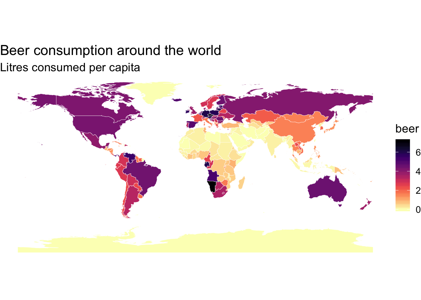
Change the legend position
q <- p +
  # this is the main part
  theme(legend.position = "bottom") +
  scale_fill_viridis(
    option = "magma",
    direction = -1,
    name = "Litres per country",
    # here we use guide_colourbar because it is still a continuous scale
    guide = guide_colorbar(
      direction = "horizontal",
      barheight = unit(2, units = "mm"),
      barwidth = unit(50, units = "mm"),
      draw.ulim = F,
      title.position = 'top',
      # some shifting around
      title.hjust = 0.5,
      label.hjust = 0.5
  ))
q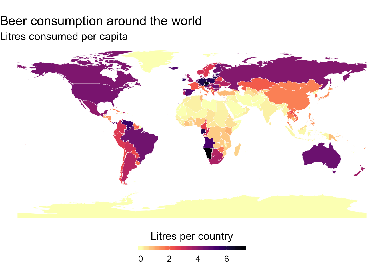
Plot a descrete variable
pp <- ggplot() +
    # municipality polygons
    geom_polygon(data = map_data, aes(fill = Continent,
                                      x = long,
                                      y = lat,
                                      group = group)) +
    # municipality outline
    geom_path(data = map_data, aes(x = long,
                                   y = lat,
                                   group = group),
              color = "white", size = 0.1) +
    coord_equal() +
    theme_map() +
    theme(legend.position = "bottom") +
    labs(x = NULL,
         y = NULL,
         title = "The continents of the world")
brks_scale <- levels(map_data$Continent)
labels_scale <- rev(brks_scale)
qq <- pp +
    # now we have to use a manual scale,
    # because only ever one number should be shown per label
    scale_fill_manual(
          # in manual scales, one has to define colors, well, manually
          # I can directly access them using viridis' magma-function
          values = rev(magma(6)),
          breaks = rev(brks_scale),
          name = "Continents",
          drop = FALSE,
          labels = labels_scale,
          guide = guide_legend(
            direction = "horizontal",
            title.position = 'top',
            # I shift the labels around, they should be placed
            # exactly at the right end of each legend key
            title.hjust = 0.5,
            label.hjust = 1,
            nrow = 1,
            byrow = T,
            # also the guide needs to be reversed
            reverse = T,
            label.position = "bottom"
          )
      )

qq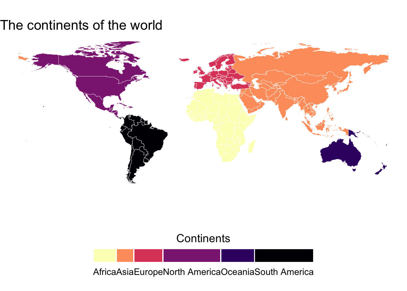
A link to more things you can add to the plot https://timogrossenbacher.ch/2016/12/beautiful-thematic-maps-with-ggplot2-only/
Add bubble plots
#create the data for the bubbles
ggplot() +
  geom_polygon(data = map_data, aes(x=long,
                                    y = lat,
                                    group = group),
               fill="grey", alpha=0.3)+
   geom_path(data = map_data, aes(x = long,
                                   y = lat,
                                   group = group),
              color = "black", size = 0.1)+
  geom_point(data=map_data, aes(x=x, y=y, size=total, color = total))+
  scale_size_continuous(range=c(0.3,5)) +
  scale_color_viridis(option = "viridis",direction = -1)+
  theme_void()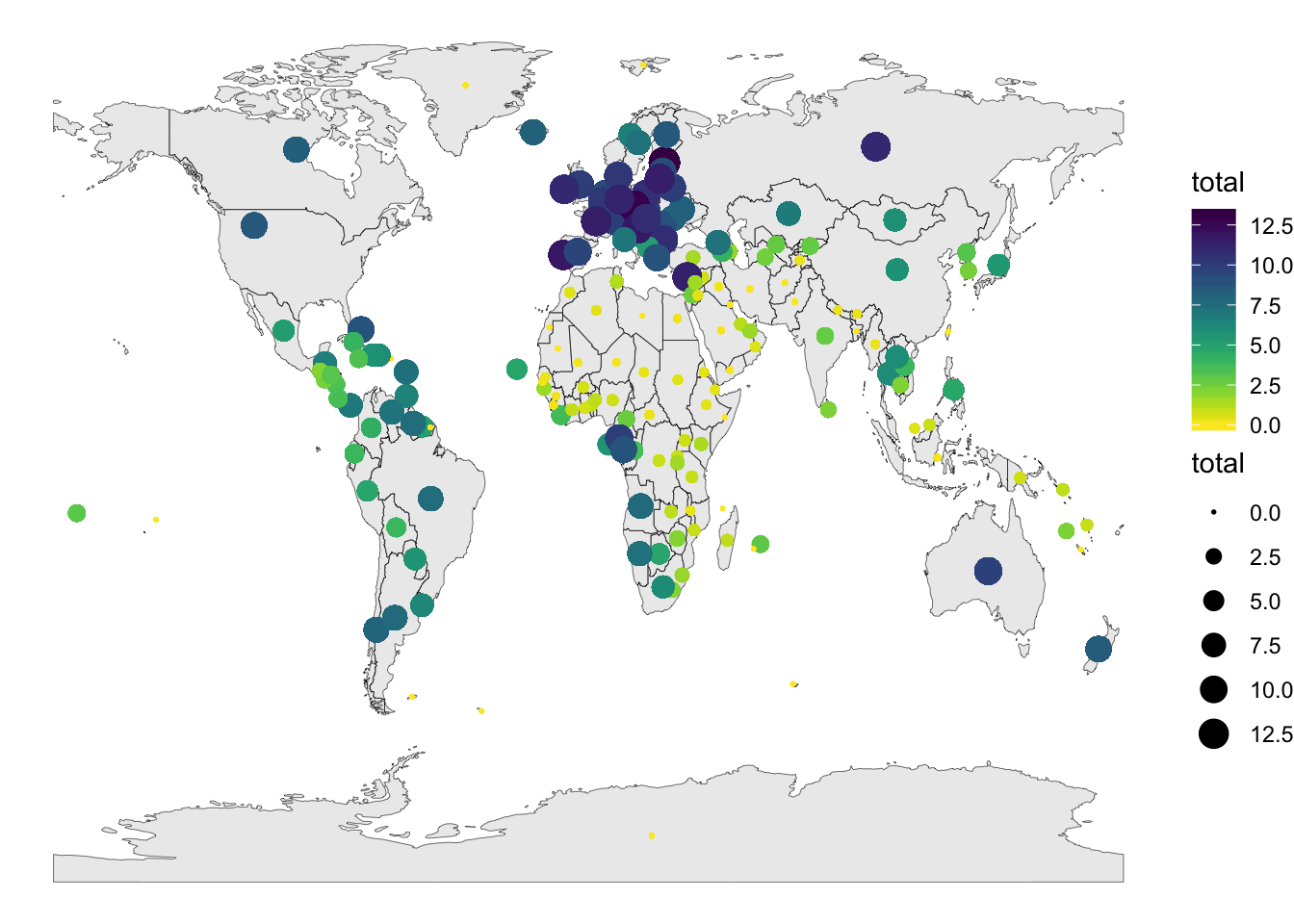
EXCERCISE
Plot each one of the alcohol consumption types data (beer, wine, spirits) on a map and put them next to eachother in a grid plot of 2X2.
leaflet
leaflet is another JavaScript based package that creates intereactive geographical plots. It uses %>% to connect between the layers of the plot.
Basic example
Lets put a random point on a default map
m <- leaflet() %>%
  addTiles() %>%  # Add default OpenStreetMap map tiles as a background
  addMarkers(34.807371, 32.115358, popup="Where we are in the world")
m
Backgrounds
We can change the basemap we are using to either one from the internet or a shapefile we have. We will do this using addProviderTiles() that hosts many free third-party maps.
For example a black and white version
m %>% addProviderTiles(providers$Stamen.Toner)Or a grey version
m %>% addProviderTiles(providers$CartoDB.Positron)Popups
# create a string with the adrdess and the link to the location
content <- paste(sep = "<br/>",
  "<b><a href='https://smnh.tau.ac.il/'>The Steinhardt Museum of Natural History</a></b>",
  "Klausner St 12",
  "Tel Aviv-Yafo, IL"
)

# plot a default map
leaflet() %>% addTiles() %>%
  #add popup GPS coordinates, content variable allows the popup to appear
  addPopups(34.807371, 32.115358, content)
You can use this website to find GPS coordinates for the address you are interested in https://www.gps-coordinates.net/
Let’s put popups in the center of all our countries with their names
#create the data that we will pass to the popup layer.
df<- data_vis.sp@data[,c("CNTRY_NAME","x","y")]

leaflet(df) %>% addTiles() %>%
  addMarkers(~x, ~y, popup = ~htmlEscape(CNTRY_NAME))
Labels and Markers
Labels will make the information in the popup markers appear when you hover over them
leaflet(df) %>% addTiles() %>%
  addMarkers(~x, ~y, label = ~htmlEscape(CNTRY_NAME))
Clustering markers
leaflet(data_vis.sp) %>% addTiles() %>% addMarkers(~x,~y,
  clusterOptions = markerClusterOptions()
)
Customize label appearence
Let’s use only three countries so that it will be a bit more useful. In this case we’ll make the lables constant using noHide = T in the labelOptions
#create the data
df2<- filter(data_vis.sp@data, CNTRY_NAME %in% c("United States","Russia","Papua New Guinea"))
#control the looks of each label
leaflet(df2) %>% addTiles() %>%
  addMarkers(~x[1], ~y[1], label = ~htmlEscape(CNTRY_NAME[1]),
             #this is a use of CSS programming language to change the parameters of the label
             labelOptions = labelOptions(noHide = T,
                                         direction = "bottom",
                                         style = list(
                                           "color" = "red",
                                           "font-family" = "serif",
                                           "font-style" = "italic",
                                           "box-shadow" = "3px 3px rgba(0,0,0,0.25)",
                                           "font-size" = "12px",
                                           "border-color" = "rgba(0,0,0,0.5)"
                                           ))) %>%
    addMarkers(~x[2], ~y[2], label = ~htmlEscape(CNTRY_NAME[2]),
             labelOptions = labelOptions(noHide = T, textsize = "15px"
                                           )) %>%
  addMarkers(~x[3], ~y[3], label = ~htmlEscape(CNTRY_NAME[3]),
             labelOptions = labelOptions(noHide = T, textOnly = TRUE
                                           ))
Customise marker
#create an object with custom markers
leafIcons <- icons(
  iconUrl = ifelse(df2$SQKM_CNTRY < 10000000,
    "http://leafletjs.com/examples/custom-icons/leaf-green.png",
    "http://leafletjs.com/examples/custom-icons/leaf-red.png"
  ),
  iconWidth = 38, iconHeight = 95,
  iconAnchorX = 22, iconAnchorY = 94,
  shadowUrl = "http://leafletjs.com/examples/custom-icons/leaf-shadow.png",
  shadowWidth = 50, shadowHeight = 64,
  shadowAnchorX = 4, shadowAnchorY = 62
)

leaflet(data = df2) %>% addTiles() %>%
  addMarkers(~x, ~y, icon = leafIcons)
Or a more specific option
url.r<- "https://toppng.com/public/uploads/preview/vladimir-putin-11530963554dkmmv4ldms.png"
url.us<- "https://toppng.com/public/uploads/preview/donald-trump-11530966029o6kuaps0i2.png"
url.png<- "https://tinyurl.com/ybehw368"

oceanIcons <- icons(iconUrl = c(url.png,url.r,url.us),
                    iconWidth = 40, iconHeight = 40)

leaflet(df2) %>% addTiles() %>%
  # Select from oceanIcons based on df$type
  addMarkers(~x,~y,icon = ~oceanIcons)
Polygons and Lines
Let’s color only few countries from our polygon
#subset the data. Use the first 10 countries
data_vis.sp_sub<- data_vis.sp[1:10,]

#pass the data to leaflet
leaflet(data_vis.sp_sub) %>%
  #add a base background
  addTiles() %>%
  #add the polygon with colors based on the size cut-off.
  #The first color is passed to the borders of the polygons
  addPolygons(color = "#444444", weight = 1, smoothFactor = 0.5,
    opacity = 1.0, fillOpacity = 0.5,
    #fill color determines what to color based on a condition (SQKM_CNTRY) and makes sure that it is indeed colored
    fillColor = ~colorQuantile("YlOrRd", SQKM_CNTRY)(SQKM_CNTRY),
    #highlight is met to define the border
    highlightOptions = highlightOptions(color = "white", weight = 2,
      bringToFront = TRUE))
Circles on maps
Lets add circles with changing size based on the total alcohol consumption
# We'll use the data from the shapefile we created previously
df3<- data_vis.sp_sub@data

leaflet(df3) %>%
  addTiles() %>%
  addCircles(lng = ~x, lat = ~y, weight = 1,
    radius = ~sqrt(total) * 90000, popup = ~CNTRY_NAME)
Choropleths maps
Choropleths refers to maps in which the polygons are colored based on a continuous or a discrete variable. This is similar to what we did with ggplot2
Lets start with a basic one, color the countries based on spirit consumption
# create the color palette with viridis, let it decide the bins by itself
pal <- leaflet::colorBin(viridis_pal(option = "A",direction = -1)(5), domain = data_vis.sp$wine)
# this comment pal object is using colorBrewer in case you want a different method to create your colors
# pal <- colorBin("RdYlBu", domain = data_vis.sp@data$spirits)
# plot the data
m <- leaflet(data_vis.sp) %>%
  setView(0, 37.8, 1.5) %>%
  addProviderTiles(providers$Esri.WorldStreetMap)
m %>% addPolygons(
  fillColor = ~pal(wine),
  weight = 1,
  opacity = 0.5,
  color = "black",
  dashArray = "3",
  fillOpacity = 0.8)
Highlight the country
Lets add an option of highlighting the country our mouse pointer is currently over
m<- m %>% addPolygons(
  fillColor = ~pal(wine),
  weight = 1,
  opacity = 1,
  color = "black",
  dashArray = "3",
  fillOpacity = 0.9,
  highlight = highlightOptions(
    weight = 3,
    color = "#666",
    dashArray = "",
    fillOpacity = 0.5,
    bringToFront = TRUE))
m
Add a legend
Basic legend
m %>% addLegend(pal = pal, values = ~wine, opacity = 0.7, title = NULL,
  position = "bottomleft")
Adding some stuff to the legend
m %>% addLegend("bottomright", pal = pal, values = ~wine,
    title = "Wine liters per person",
    labFormat = labelFormat(suffix = " Liters"),
    opacity = 1
  )
Add a minimap to see where we are in the world
m %>%
  addProviderTiles(providers$Esri.WorldStreetMap) %>%
  addMiniMap()